Our Logo
![]()
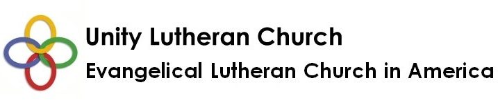
![]() During one of our Sunday gatherings, we explored what our name and logo represents for us as a community in Christ. Three of the rings represent our former congregations: the tranquil blue of Peace, grounded reality green of Calvary and loving red of Our Redeemer’s. We then considered the meaning of the fourth gold ring. As a church, we are interconnected not only to one another, but linked to the divine.
During one of our Sunday gatherings, we explored what our name and logo represents for us as a community in Christ. Three of the rings represent our former congregations: the tranquil blue of Peace, grounded reality green of Calvary and loving red of Our Redeemer’s. We then considered the meaning of the fourth gold ring. As a church, we are interconnected not only to one another, but linked to the divine.
With our new sign logo completed, we had volunteers hold on to each of the rings and then gave them a task: to walk to the back of the church.
The three volunteers started to move slowly and consider what the other two were doing. They were doing great, yet that isn’t always the case with every task at church, at work or in our daily lives. With two aisles in our sanctuary, they might have wanted to go different ways. However, to go different ways would require them to break the links with one another and perhaps even with God.
But together, we are Unity when we listen and look toward one another and God. It has helped us this far as Unity Lutheran Church of South San Francisco and Millbrae. May we rejoice and give thanks for the Spirit’s presence and guidance!
One last thing . . . that must be first. This cherished gold ring represents something else.
The other, the new person who blesses us with their presence – for we are to see Christ in the other.
We must be open to their thoughts and suggestions – to invite them to create and shape new meaning within the community.
It may lead and even taken us on an alternative path, a new path “out through the courtyard”, where a third aisle, a new way is created like we did at that Sunday gathering!